Plasma Studio
Villa drei birken - Sesto (BZ)
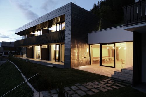
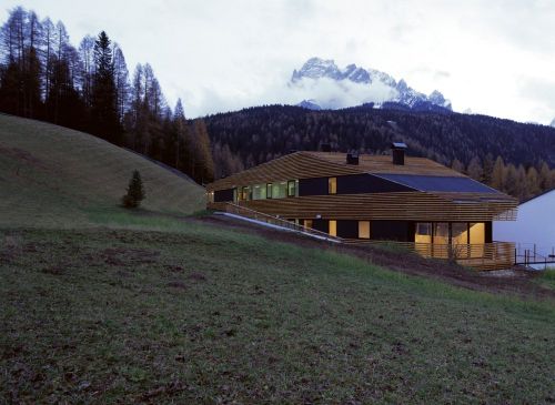
The new extension adds six holiday apartments as well as functional and common spaces. The facade opens through a v-shaped surface from the mostly closed north facade to the completely glazed south facade, facing the sun and the panoramic view of the dolomites.
Although it is connected in the lower level to the existing villa, the new construction is designed to appear as a free-standing building. Perfectly integrated into the hillside thanks to its accessible extensive green roof with integrated terrace, the new volume occupies the full width the plot. It is slightly rotated in order to direct the south facade to the sun and the panoramic view. The joint in the lower level connects the new with the existing building and serves as common dining room. The east and north façades are relatively closed because of the interior’s functional distribution; furthermore, the north side is designed to show the clear separation between the new and the existing building. The volume is accessible from the street side, where also the car parking is located. The six spacious holiday apartments are directed to the sun, with panoramic view of the dolomites.
Material
The new building’s envelope is made of only three main materials: it’s walls are clad with horizontal preoxidized copper sheets of various width while the northern recessed area and the balconies are offset with larch wood strip boards. In addition, full-height glazing is predominantly employed on the southern façade. The larch wood is treated with a pigmented graying solution of iron sulphate, in order to diversify the north service volume. Copper and larch wood are exposed to a natural change of colour caused by the atmospheric influence of sun, rain and snow; this phenomena, in addition to the repetition of the wooden colour code of the villa, further increases the integration of the building into its context over time.
The interior is clear, simple and functional. It contains custom furniture in birch plywood, which is oiled or dark stained so as to be similar to the copper.
Particular attention was paid to improving the energy performance of the building, such as doors and windows with triple glass, controlled ventilation system, heating system connected to a wooden pellets district heating plant and heat-sound insulation with wooden fiber.
Ban xue gang art center - Shenzhen, China
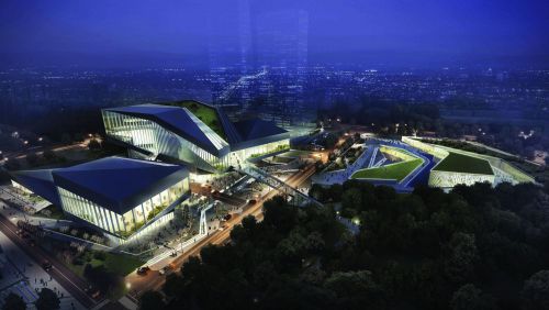
The concept started with the combination of human and nature. Taking the golden mountain park, which is the most important local natural element into consideration. The new configuration has been shaped starting from a parametric analysis of the site, including water runoff, view, traffic and land use of the surrounding area. The aim of the design strategy is to foster the integration of this area into the surrounding with a vibrant, ecological, commercial program on the ground level and a highly social and cultural program on the top, so as to create a new model of the art centre.
Zhuhai public cultural center library - Zuhai, China
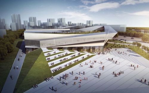
The project is based on the use of a privileged positioning of the building within a corner site, so as to celebrate the various views of the diverse landscapes around it. It has been created the main ribbon, driven by a circulation shaped by the views. It starts in the northeast corner of the site at the last floor all the way till the south-east to create a panoramic platform for the urban frontage of the site; then it starts to descend towards the southwest as it approaches the water frontage and its beautiful views. Finally, it turns around at the northwest corner and it touches the ground level to embrace the landscape and the inner plaza. The green strategy is based on the idea of ‘pulling’ and ‘stretching’ the proposed green running along the waterfront into the site, generating a series of green spaces along with it and anchoring 3 plazas: one internal, more intimate, and two public, facing the waterfront and the city.
Xi'an creativity pavilion - Xi'an, China
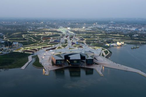
The creativity pavilion- the main building of the expo- is located on the edge of the lake as the endpoint to the central axis, is formed to articulate the interface with the lake and the framing of the pagoda on the other shore. It ties in with a series of piers that follow the landscape jutting out into the water. The built volumes are interwoven with the ground, blurring the distinction between landscape and architecture.
The building’s exterior articulation is undermining traditional hierarchies and expectations: it reads as a series of mounds when visitors arrive to it from the north, while in turn becoming sculptural and iconic when seen from its backside with three long cantilevered volumes hovering above the lake. The spaces beneath those large cantilevers are spatially as well as socially engaging: far away from the control and representational confines of the building’s entrance, in pleasant shade with sunlight reflected by the lake, groups of visitors gather on sloped decks to rest and reflect.
Through its materiality the creativity pavilion again manifests itself as an extension of the ground with the lower part being clad from the same stone panels as the ground around it. Further above solid cast bronze panels, a locally sourced material, is used to wrap the building’s sides and roof, while bands of greenery cover it like a tessellated net.
Xi'an eco-restaurant - Xi'an, China
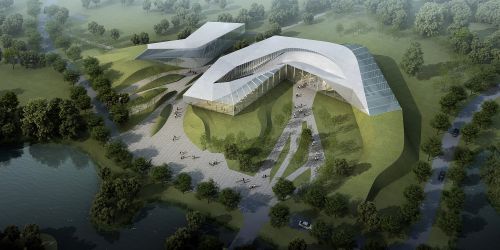
The experience offered to dinners includes picking their own vegetables and following its cooking process. In addition to the dining experience, the project proposes some auxiliary activities such as a children playground and a greenhouse, both included in the internal layout of the restaurant. Such functions and their distinctive spatial requirements—both layout and materiality—are woven into the two ribbon like bodies converging by the entrance. Morphologically speaking, the building grows from the topography at the north, evolving into a sinuous body that splits creating a gap for natural light and a vertiginous volumetric drop at the entrance plaza. Toward the south, it sits onto an artificial higher elevation, hence allowing for a series of ludicrous spaces (children playground and greenhouse) that play with the slopes through some slanted surfaces, among which we locate the main access ramp to the upper floor. The butterfly house is located on the south outer ring of the building. With the comparison of the continuity on the north side, the butterfly house is inserted into the building as a glass case that brings the landscape indoors. At the same time, a series of spaces are generated as an integrated body that interweaves the landscape, the playground and the two main floors of the restaurant. Diagrammatically speaking, the building is a major arc with both of its end points at the lowest elevation (+0.00m) and its middle point at the highest elevation (+3.80m). The three-dimensional spatial distribution resembles a ascendant spiral movement which is actualized by a membrane that more than covering/enclosing the internal area of this arc, augments the rich plasticity of the diagram as such. On the north side, at one of the endpoints, this roof is generated by 5 curves that bifurcate from linescoming out of the surrounding topography. These curves runalong various elevations, working as a veritable extension of theground to the roof of the building showcasing striations and depressions—topographic features in themselves. At the south side, at the other end point, two of the controlling curves of the roof drop dramatically reaching the ground, while the other remaining curves stay at a higher elevation. The former movement generates a “valley”, as seen from the outside. From the inside, this depression articulates the ascendant spiral of the main ramp, onto which the children playground and greenhouse are unfolded.
Kfas headquarter and conference center - Kuwait City, Kuwait
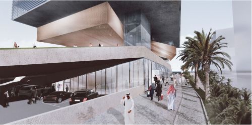
The urban design concept is based on recomposing and connecting, whilst fostering key moments from within which future growth can occur. We conceptualize this urban fabric as a tissue in need of further material definition to generate a strong identity; its own character informed by both, the architectural instances (de)marking places on the one hand and the movement of pedestrians, which in due time will lend itself to additional activities and further intensification of the area.
The kfas headquarters is formed by three basic elements; a plinth, a vertical block/tower and a 0 level plaza.
The plinth forms by decreasing its height and giving space to the neighboring building, whilst lifting its northeast corner to mark its presence more fully in the plot. Instead, toward the southeast it folds down to gently welcome users, inviting to ascend toward its top surface and reach the viewing plaza, where an unobstructed vista opens toward the entire gulf area.
The two volumes of the tower are sharp edged and connected by a central void that runs throughout the entire building providing ventilation, light and a variety of spaces for social gathering and relaxation within the offices setup.
This plaza is one of the larger open space instances we propose with the urban proposal to generate a system of shaded spaces able to invite pedestrian movement within the area.
The conference centre likewise the headquarters, is composed also of a plinth – acting as an urban plaza, an overhanging volume and the floating auditorium.
We have purposely played the auditorium’s duality by being formally a very articulated volume, yet austere in the choice of its rendered surfaces; heavy in its all around concrete presence, yet (and even the more) magical in its floaty appearance; single, self-standing and defining singularity, yet malleable in its connective capacity throughout the building.
House h - Dobbiaco (BZ)
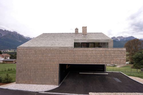
The idea of the project was developed starting from the restrictions imposed by legislation, such as minimized building surface and the requirement of a pitched roof parallel to the slope. The final volume and the concept of the whole project is the result of a subtraction process. Starting with the maximum volume (as derived from given height and surface) certain parts of the volume were substracted to create specific functions; a covered space for parking, balconies protected from the weather, and the terraces in the attic level which introduce light into the house.
While achieving the maximum volume permitted by law, the size of the building is reduced and resulted in a very compact internal circulation. The house is divided into two dwellings. The main house, used by the family of the client, is set over 3 floors. At the entry level there are the bedrooms, at the lower level the living area and kitchen with access to the garden and in the basement the secondary rooms.
In the small attic there is a second apartment, which enjoys spacious terraces obtained from the volumetric removal.
Material
The choice of materials follows the philosophy of reduce, which is proper the entire building. Exterior walls and roof are made with one single material, white cedar shingles, a traditional local material system with exceptional resistance to weathering. Initially pearl-colored, it will over time change into a uniform light grey. The only other material are the glazing, used for the entire height of the openings, and the metal frames and stainless steel edge details.
Particular attention was paid to reducing the carbon footprint of the building by employing windows with triple glazing, controlled ventilation, a heating system with pellet stove and extended insulation with wooden fibers. In the interior lime-based plaster throughout guarantees excellent acoustic performance and moisture control.
Huafa square planning - Zuhai, China
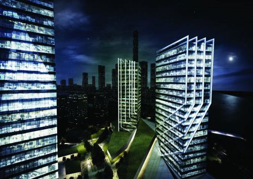
Surrounded by residences the commercial podium will be the main attractor for the population needs. Commercial podium is chronologically the first element encounter by the user. The people attracted by this series of monolithic volumes, would start moving towards them. They would have gradually the feeling to become part of them. This is happening because the flows of people is the element that shaped this geometry producing those cuts. The people by moving in the site would reproduce the act that generated the geometry, over and over again.
Also the elegance of the towers take inspiration from the natural world. A plant that gently climb up by twisting and wrapping around and existing element. The movement is executed as soft as possible, the climbing plant is almost trying to protect the other ones in a maternal hug. In the same way it has been developed a skin system of lamellas that by twisting around the towers embrace them in a gentle movement enhancing the geometry and the verticality. The tallest tower have a more important presence among the complex. For this reason it has been decided to start with a glorious concept of a mineral that grows tall form its own sediment layer. It`s like a rock that become a diamond
The future of brno Architecture - Brno, Czech Republic

This sculptural railway station will be the new iconic gate of the city of brno: its bridge development not only gathers the access to the new high speed line but also enhances the connection to the new neighborhood linking the plaza in front of mala america and the old city with the site.
Located in front of the tram stop, the building includes internal bikes and peripherical car parkings to allow an easy sustainable access to the city.
The second phase goes along with the creation of the university of applied arts: its position in direct connection with the mala america creates a duality of a cultural pole that enhances the existing values and integrates the needs of a new educational space.
Located at a walking distance from the train station in a highly connected site, the university becomes the center of a sustainable and integrated district for students and workers. Its stategic position in between of the old city and the new area makes it a natural extension of the historic center into the new development, integrating the functions and public of the first into the second.
The mixed-use housing typology is based on linear 4 storey high blocks that loosely form courtyards. Reinterpreting and updating the classic block typology succesfully present in brno, they create a distinction between public linear spaces and semi-public courtyards to give a sense of identity and belonging. This basic framework can be calibrated towards varying degrees of permeability and privacy. By the same token the non-prescriptive, generic nature of the typology can be interpreted by different architects in diverse ways to introduce diversity and character. At the same time the highly articulated ground strategy holds it all together with the greenery and a sculptural meshwork of varying paths, streets and canals.
Starting from the same linear block typology proposed for mixed-use housing, the high-end residential buildings are composed by single, double and family apartments. Located at the boundaries of the park, their position gives them a preferential access to the leisure and social activities of the landscape. To protect them from the possible floodings of the river svratka and to create a sense of privacy, their ground is free and sustained by structural elements or landing on the topography adjacent the ponds, creating entrances on different height. Instead of enclosing the private space with the traditional fences, here the use of different paths of hardscape and planting strategies define the property line with a subtle and integrated language.
The third and final phase of the development is driven by the completion of the cultural anchors. After the mala america and the university of applied arts, we introduce the incubator: a multifunctional center intended to connect artists with the public in a spontaneous and social setting. Defined as an extension of the risen railway deck, the topographic roof is divided into two sheds containing exhibition halls, small commercial activities and reading areas.
In the same way that the new train station welcomes the visitors from the city centre, the incubator forms a gateway and cornerstone for the new area from the south
Resort & chalets jasna’ - Jasna', Slovakia
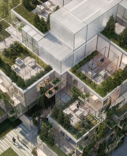
The site is located in a special and beautiful valley, and the intent of the design is to protect and to increase the quality of context of the existing natural environment with addition of the designed architectural solution.
The plot, subdivided in two different portions, has the unique characteristic to be surrounded from the high trees of the forest, and it has a strategic location for his closeness with the ski lines, with the public bus transportation and it is easily reached by car.
The strategy has been to start with the creation of a system of components, modular.
Those blocks can host perfectly the four different apartments typologies requested, and also important functions like services, circulations, parking areas and common utilities for the users.
For this specific plot, it has been set up important guide lines to follow up in the process of adaptation and creation of the design building from the starting system.
From the analysis have been understood important key points like:
-integration with the surrounding forest with the technique of the camouflage;
-creation of contemporaneity, high quality architectural language;
-flexibility and possibility of future changes and dialogue with the client.
Izmir university of economy university - Izmir, Turkey
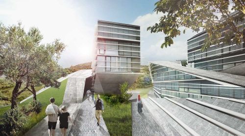
This configuration enables a clear hierarchy and orientation, as well as giving identity to the individual parts while fostering chance encounters and a vibrant communal life.
Additional synergies derive from interspersing semi-public/ leisure activities within the academic environment, so as to create a common strata, to informally encourage social interaction, encounters and proliferation of knowledge across social and disciplinary confines.
The plinth/ or podium_ clustering, a grouping strategy to share the academic facilities, fostering crosspollination among various disciplines. This attempt is substantiated through social interaction by inserting semipublic/ leisure like activities within the academic environment. Transgressing the traditional isolation of the individual faculty, the project proposes a common strata, where the knowledge is distributed ‘horizontally’ through informal encounters among students. The proposal believes in enhancing the built up of novel knowledge, in encouraging the practice of trans-disciplinary research.
Hotel a. - Trento (TN)
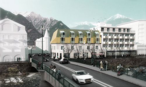
The hotel is located in a prominent position in the center of the city within an important historic context of liberty buildings. The project’s main task is therefore to design the extension without compromising the view from and towards important points of architectural and urban interest in the neighborhood of the hotel. The new addition should not dominate historic surroundings.
At the same time, the project should be a visual continuation of the existing hotel with its fascinating rhythmic façade overlooking a promenade along the river and the thermal baths of the town. The volume of new room’s wing should not be read as a façade but as the surface of a pitched/inclined roof: the new intervention is separated from the existing through a small shadow gap, while a deliberately slightly-bent surface structures and breaks the volume and attracts at the same time the viewer’s gaze. The chosen material for the intervention is brass which repeats the material language of the surrounding liberty architecture as well as the interior of the existing hotel. The new volume takes up the rhythm of the underlying existing façade and translates it into dormer-like glass structures that form balconies for the rooms.
Paramount-alma - Sesto (BZ)
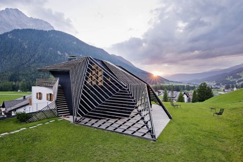
In 2014, to the neighboring residence alma, a guesthouse built in the 1960s, got rid of an underused pitched roof , a previously non-existent vertical circulation and the dwelling for the host family were added.
Due to the immediate neighborhood of the strata hotel, the theme of the wooden stick was readopted: this time, two bands follow the geometrically complex volume, pushing behind and over the white existing cube and joining with the surrounding topography. The interiors benefit from differentiated external spaces, which open up between the building volume and the wooden sticks, light openings provide panoramic views and bring the sky deep inside the building - a variation on the theme.
Strata hotel - Sesto (BZ)
Skin organisation as strata-since the overall shape was in part determined by the local planning guidelines, the linear distribution of units and the orientation of the sun and views, it is a result of the constant negotiation between these parameters, as well as a topological answer to the picturesque typologies frequently built in the area. From applying the logic of topographical mapping, i.e. The indexing of horizontal sections as continuous lines, the volume is formed as a series of strata: an artificial entity in a dialogue with its natural environment.
In addition, these horizontal sections operate as control lines, generating curved hyper-parabolic geometry. The bands surround the volume at different scales, peeling off from it, flowing into the landscape and blurring the boundaries of the building. The balconies become liminal zones that negotiate the internal rationale of the apartments, ruled by efficiency and the repetition of parts, with the exterior as an extension of the topography.
Low carbon exhibition centre - Wuxi, China
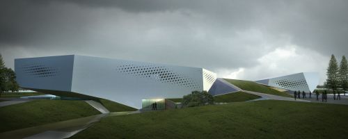
This project explores how crystalline geometry can produce a material economy while articulating the part-to-whole relationship of the internal organization.
The competition asked for three main programs: multifunctional hall, interactive hall, temporary exhibition space. These are duly and legibly represented as three main crystalline volumes of the project. These solids are connected by a tessellated mesh, and thus internally merged into one continuous yet differentiated space. The main entrance leads into a central daylight atrium from which all the other spaces can be seen and accessed.
Whilst the circulation has been designed to be clear and legible, there are other possible routes, making for an exciting visit and adding a degree of flexibility and adaptability to the project. Alternative to the main entrance, visitors can access the complex from the basement of the auditorium/multifunction hall, where the building services can be seen in action. From here they may walk up to the ground floor of the auditorium and continue on to the atrium or ascend to the auditorium mezzanine level which opens up to the accessible roofscape.
Another important aspect of this building is its integration with the ground plane. Sunken two meters into the earth, visitors descend to the entrance. The volume of excavated earth is diverted to mounds surrounding the building as an articulated landscape that, together with the built volumes, is shaped to maximize rainwater collection into specifically designed water pools. These water pools drain into two large water bodies at either end of the building. In this way, the building appears as a bridge spanning across a river. Additionally, the water bodies pre-cool the air intake on the east side, significantly adding to the natural ventilation process all year round.
Mercedes-benz campus - Stuttgart
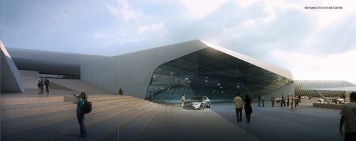
For this invited competition to complete the existing mercedes-benz campus in stuttgart with a future centre and a classic centre, we employed our cross-disciplinary and cross-scalar approach to fuse landscape and architecture as a complex yet flexible switchboard for the canalization of movements and connections of multiple programs and relationships centered around the visitor.
A seamless, yet highly differentiated groundscape forms a main central plaza as intersection and starting point for all the surrounding series of functions and spaces.
This plaza extends like a carpet upwards, in-between and around the new future- and classic centres to form the campus drive, which enables multiple arrangements to suit all kinds of events. As a series of loops across multiple levels it is like moving through a rocky landscape.
The same topographies are made accessible for pedestrians and vehicles, fostering the encounter between visitors and product in unexpected and ever-changing ways. Surface articulations through slopes, levels, textures and street furniture will replace signs and curbs. This will turn the project into a live scenario for complex and immersive urbanism with the goal of reduced urban footprints and the non-hierarchical co-existence and collaboration between all kinds of urban space participants- a sustainable and truly public space.
Tectonics and appearance are driven by the contrast between the textured stone and concrete of the landscaped surfaces and the crisp, highly refined metal and glass of the facades and roof lights. The intersections of the loops with the main building volumes are articulated as a series of carved voids. In those locations as well as the entrances, the planar geometry of the buildings becomes eroded and replaced by double-curved glass membranes that offers radically new and rich experiential moments.
Flowing gardens: xi'an international horticultural expo' - Xi'an, China
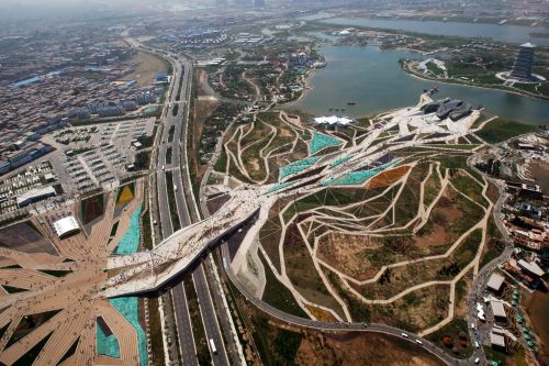
Plasma studio, in collaboration with groundlab, won this international com¬petition with a radical self-sustain-able vision. The project comprises of a 5000m2 creativity pavilion, a 4000m2 greenhouse and a 3500m2 pedestrian bridge set in a 37 ha landscape. The expo opened in 2011 to approximately 15 mio visitors.
Accomodating and channeling the given flows of visitors whilst offering them choices and variety, flowing gardens unfolds into many sinuous paths, creating a network for intermingling circulation, landscape and water. These paths vary in width, ranging from main walkways and arteries to towpaths. In this manner, the park areas manifests a variety of scales in association with specific planting, surface treatment and lighting, providing a sandbox of experiences that range from the very intimate, with semi-enclosed, self contained, one- to-one spaces, to the very public, with communal plazas formed by wider pedestrian paths and a direct, uninterrupted visual link to the main hiatus on the site.
The project’s distinctive layout, reminiscent of a root system, articulates the hybridization of both natural and artificial systems. Rainwater is collected within pockets of wetland and recycled for irrigation.
The landscape legacy plan is phased to gradually transform from an international showcase for millions of visitors towards a sustainable local asset for the evolving community around. Local plant species help to reduce maintenance and ground the new chan-ba central park within its context.
Xi'an greenhouse - Xi'an, China
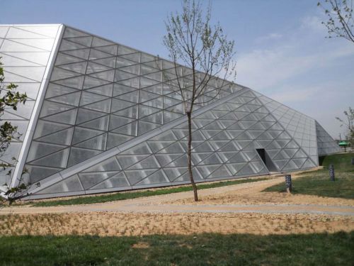
Visitors access the building through a prolonged cut, literally scooped up from the ground, emerging into a light-filled reception space. From here the visitor passes along a tessellated mesh of paths to three different climatic zones with corresponding plant environments. The greenhouse has a horseshoe plan, creating a loop that changes radically in section to accommodate a series of unique planting and spatial conditions. With the interior and exterior ground planes gradually shifting in relation to each other, the visitor experiences a sequence of visual enclosures alternating with long vistas out and across. The horseshoe shape also generates an interior open-air courtyard, making it the natural centre of the building and creating a three-dimensional web of interior and exterior circulation.
Dolomitenblick - Sesto (BZ)
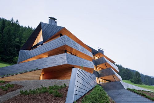
The building is located on a hillside in the dolomites, at the edge of a residential area. The volume was mainly determined by the functional elements required to host six independent apartments with a common circulation core. A formal incision marks the main access and the division of the units, splitting the main volume in two halves. This incision becomes the defining element of the building. From either side of the cut, a strip unfolds to form the balustrade of a covered balcony that merges with the surrounding topography. Following the steep natural hillside the strips and the façade jump back. The building hosts six generous holiday homes, all directed to catch the southern sun and the panoramic view of the dolomites. The material palette was reduced to a very local code: larch wood and pre-oxidized copper. By borrowing from the color palette of nearby farmhouses with dark, sunburned larch wood façades, the building blends into its natural surroundings. The strips of dark copper are surrounding the volume, form a second skin, offering shelter and defining the roof as a continuation of the overall façade. The form of the roof itself draws on the local planning regulation which allows only a pitched roof for this specific building plot. Slightly deformed, it merges with our design concept as well as with the traditional pitched roof typology.
Tetris house - San Candido (BZ)
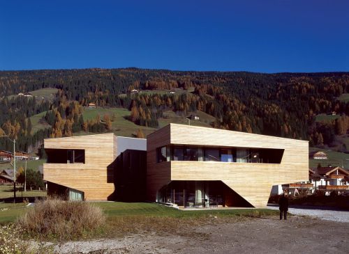
The building is organized into two volumes which divide the “private villa” of the client with ist own indipendent access from the small unites which are rented out.
An open staircase between the two parts provides the access for the small units and the common spaces which are put in the underground level. Each volume cantilevers about five meters in order to provide covered parking. The cantiliver whose structural forces are legible in the wall and the ceiling planes is the result of a series of demands and restrictions from the local government on the one hand and the client on the other:
The building site is considered to sit on a potential archeological spot with remainigs from a roman settlement. In order to avoid exessive expenses for an archeological excavation process we kept the footprint as small as possible. Respecting the local limitation in hight development and wanting to realize the possible allowed size we ended up to propose a cantiliver of the separted volumes.
Local materials such are local larch wood are used throughout the design: in the outside as covering façade material , in the inside the wood is used with a white tint. The outside sloped and shaped façade continues in the inside as a built – in sideboard that turns into a series of steps and plinth beneath the internal stairs.
Esker house - San Candido (BZ)
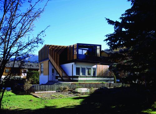
Esker house (esker=stratified geological formation) is a self-contained residential unit placed on top of an existing house from the 1960s. The project has been developed as a parasite which started from adopting the structure of the host and gradually differentiated into its own unique organization and morphology.
The project is formed by a series of steel and timber frames that deform to recreate the smooth hillsides of the surrounding dolomites. This partly accessible roofscape also determines the spatial character inside- the spaces are enfolded by an angular and dynamic series of planes creating new and ever-changing perspectives and spatial constellations.
The unique stratified morphology and construction system started off from projecting each step of the external staircase as a modulor that then was proliferated as frames. These frames enable the subsequent deformation and softening of the overall geometry.
The interior spaces are the reflection of the exterior geometry with folded planes accentuating the flow through the open split-level plan. Their character is determined by the transgressions from the cartesian orthogonal layout (determined in part by the structure below and functional requirements) towards the soft and fluid morphology of the roofscape.
Frontsea landscape - Shenzhen, China
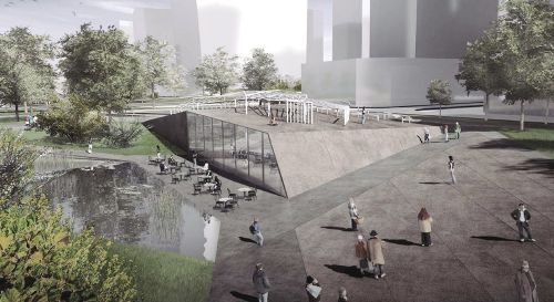
It is not only expanding the green space near the greening belt, but also design these green spaces particularly based on the zoning code and urban infrastructures to archive a service lead landscape urbanism. With the four typologies in this site: housing, commercial, tourism and office, we are able to design the site with the support of pragmatic design approach and the power of programming language, which would fully considered the zoning codes and the linkage to greenbelt to achieve a better efficiency. The hydro system as a sub-system of this landscape planning would also play a key role. The early proposal is to using wetland cleaning system is replaced by branch like hydro system due to the economic and construction limitations. The new proposal would draw the design attention back to the green finger itself. Meanwhile, the green finger would become the most lively space in the area. As the one third of the site area will become green spaces. In a world with low-carbon in its fashion, the environment friendly way to sustain the site would be using recycling the water from the site for irrigation. However, it is also the biggest challenge to the hydro system. The key is how to design a ground structure to collecting the sewage water in the nearby areas. The architectures in the site have been designed in clusters as a higher efficient system to collect sewage water. Through sewage treatment, the cleaning water will be redistributed to the branche system of hydro grid. The ultimate objective of this design is to archive an self-sustain site, as a pragmatic approach for landscape urbanism.
Cube house - Sesto (BZ)
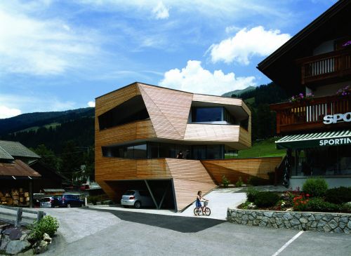
It is inserted into the earth with 2 covered parking spaces to the front from where a small stair case leads up to the main living zones in the first floor and further to the bedrooms in the second floor.
Because of the limited available floor area the horizontal and vertical circulation had to be designed in a very space saving way.
Given prominent location of the site directed towards the south and the dolomites the façade was opened as much as possible in order to widen up the tights interiors in order to provide shelter from the views of the passing- by road a layer of wooden sticks was wrapped around the big openings directed to the south – depending on the varying size of the openings they provide different degrees of shelter and intimacy.
Schäfer roofscape - San Candido (BZ)
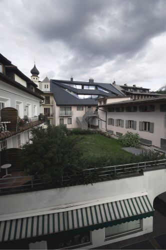
The first three storeys house a department store while the upper three storeys serve as four large, independent apartments within the formerly underused attic space.
The building faces a public plaza protected by local regulations, thus, efforts were directed towards its rear facade. This west-facing elevation explores how slicing and folding can be employed to expand the limits of the ubiquitous pitch roof typology: large glazed balcony slots produce bright, contemporary living conditions and generous exterior expansion space within this dense urban situation. A marked departure from the neighbouring vernacular buildings.
Tagliente - -
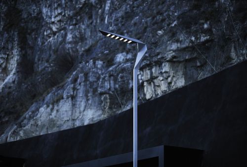
With the advent of led lamps suitable for outdoor lighting, ewo, the bolzano-based, international manufacturer of high quality lighting systems asked plasma studio to develop a new type of street light adequate for this new technology.
After an extensive period of digital design, the breakthrough came at a hands-on workshop at ewo's fabrication facilities in bolzano. It was revealing to see a prototype at its true height: 6m in the air. This set in motion a rigorous, yet instant, oscillation of alteration and assessment.
By remaining ambiguously between industrial and natural form, we observed that the object's relationship to the context has been surprisingly versatile: the light was first exhibited at plasma studio's nodal landscapes exhibition at the daz berlin where it formed a dynamic extension to the orthogonal grids of a typical berlin "hinterhof". Thereafter the object was displayed in front of the ewo headquarter building, a contemporary context that enables it to articulate the link between the natural rocky backdrop and the man-made, orthogonal structures.
Circus house - London, Uk
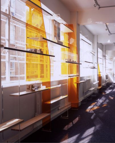
A room-long workbench provides a backbone for a series of workstations. At one end it folds down to form visitor seating. This intention to unify the worksphere with the reception of visitors is further enhanced by carrying the overall aesthetic to the reception desk.
An extensive display system made from a series of perspex risers highlights the structural modular of the building, and projects daylight into the space in unpredictable and fluctuating ways. The risers are cut in order to reveal a continuous wedge-shaped volume that differentiates the corridor from its sides. Its shelves, made from a combination of folded perforated steel and plywood, are arranged in a school-of-fish pattern. In keeping with the riser motif, this suggests coherence amongst individuals that form a community. Carrying working and presentation models, this pattern is representative of the firm's working methods and social framework.
A new staircase was inserted to connect both floors of the office. Solid planks of plywood are suspended from full height perspex screens; in this way, the stair reads as an extension of the display system.
The action of walking up the stairs thus corresponds to physically entering the display. The shape and material of the elements have been chosen to abstract the experience from possible semantic interpretations, but, at the same time, induce an excess of ephemeral visual conditions.
Minerva loft - London, Uk
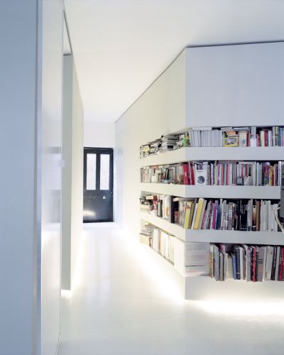
The edges of the inserted pods have been defined by vectors that slice the space into a jig of relationships; and thus, connect it to the context. Marked by translucent sliding doors, these vectors enable the transition from an open space with inserted volumes into an intimate series of separate spaces.
All new inserted volumes are finished in various shades of grey, allowing for a reading of the changing light conditions throughout the day. Recessed fluorescent tubes run along the bottom edge of the walls to prevent glare and create the right ambiance for the clients' work: video production.
Sunken garden - Beijing, China
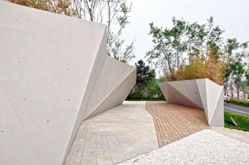
Sunken ground looks at concepts present in suzhou gardens tradition, such as the rock, the outcrop and the occidental equivalent of the grotto to then travel in space and time to the image of hanging gardens and further on to the concept of a sunken courtyard. The result is a combination both of intense distortions of the ground and an acute sense of three dimensionally, where one feels itself draped by concrete, steel and vegetation, free to explore a thickened version of a microcosm in a series of pocket landscapes for reflection, relaxation and ultimate playfulness. The first idea is that of the canyon, as a compressed landscape into the space of a corridor. Natural canyons both have the intense spatial quality of the enclosed space, but also inherit the layered characteristics of the geological formation, showing strata, cracks and faults of the matrix rock. We wanted to use this feeling of thickness and formational to explore how architectural elements can fabricate a passage where material, shade and enclosure would dictate the main spatial experience. The pots serve as meandering elements within the larger landscape, a large scale version of traditional suzhou garden component of the rock boulder and the miniaturized landscape. Some of the traditional gardens also incorporate an element of circulation with these rocks, so that they become both miniature, but also belvedere and observation. Sunken ground concept uses these traditions to generate a diverse experience where the levels inside the pots are thought so that visitors can experience the full three dimensionality of the park, climbing to the top of the pot, looking at other pots and the flow of people around. Finally, pavement and plan patterns flow along the entire site, giving it a sense of totality, continuity and ultimate harmony to the park. These pots which contain external ecological environment are similar to the others in terms of material. But due to the fact of enclosure, visitors will not be able to enter. Inside of them are sets of artificial ecological system which are also self-sufficient, in whichmsome technical tools will be used.
Multiplying grounds - Astana, Kazakhstan
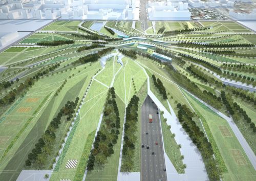
Plasma studio project is developed to enhance the given framework, highlight the axis and develop a central meeting place in a contemporary, dynamic and exciting way.
Mobility center - San Candido (BZ)
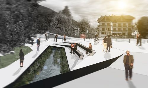
The new mobility centre is formed as a new public plaza and natural underpass beneath the rail tracks for pedestrian and bicycle movement. Motorized vehicles can be parked on the northern side with convenient short walk to the town’s historic and commercial center. The mobility hub accommodates connection and exchange between train, bus, car, bike and electric mobility. The whole plaza will follow the guidelines of a shared space and works as a continuation of the already existing pedestrian zone.
The new territory that results from a reduction in the overall amount of rail tracks and surplus capacity will be swapped by rerouting the regional road alongside the remaining tracks. This will enhance future connection and development for the north side of the town and enables a buffer zone for adjunct functions. Additional new areas and existing buildings will combine to provide growth and synergies for an adjunct commercial park.
The masterplan envisions new social programs such as a skate park and a youth center to occupy additional vacant land and the old historical buildings of the former train station.
Woven grounds - Taichung, Taiwan
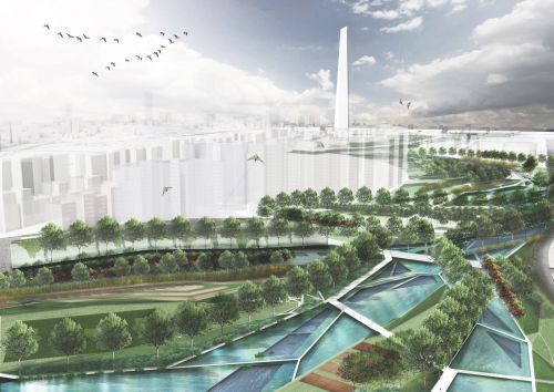
A park acts as a differential between city and nature, a place where citizens can expand and balance their daily environmental experiences from mostly urban towards nature and the rural. In this sense, the park weaves distant and local territories into the ultimate form of metropolitan experience, helping to forge character and long-term vision of the entire city. Weaving becomes the main concept and formal driver: the very materials of the park, water, earth and plants are being deployed to articulate an integrated approach made-up by three scales of weaving: weaving of the infrastructure of taichung, weaving the scales of the park and finally weaving the ecologies within the park itself to develop a new form of hybrid between landscape and urbanism.
Datong twins towers - Datong, China
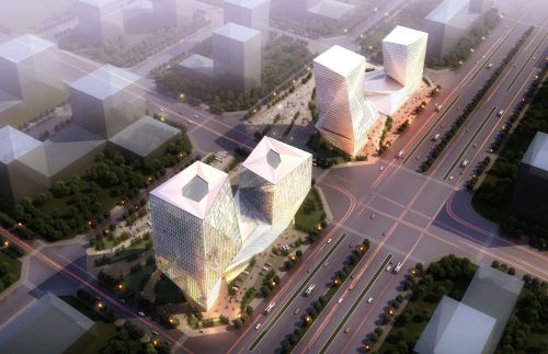
Plasmastudio design emerges from this ambiguity: proposing a building that is derived from access flows and the surrounding urban landscape. The dual axis disposition of these vectors in turn influences the layout of the internal connections.
From simple mirrored symmetry, this proposal evolved into a dynamic 'yin and yang' formation connected by the spiraling ramp system that weaves the two towers together at lower levels.
Spaces and connections grow from the base of the building, continuing in a loop that is deformed, to branch into the two towers, eventually extending to the roofscape.
This unique network of connections and the intersection of different spatial qualities and densities transform and deform the twin towers type to create a more complex system.
The two central cave spaces, which host various events throughout the year, function as solar energy stores in winter and as wind towers in summer. This strategy works alongside a cooling and heating system driven by a geothermal pump to minimize energy consumption. In addition, the facade is designed to optimise daylighting and internal temperatures through passive systems, varying according to the type of activity that takes place within.
Helsinki library - Helsinki, Finland
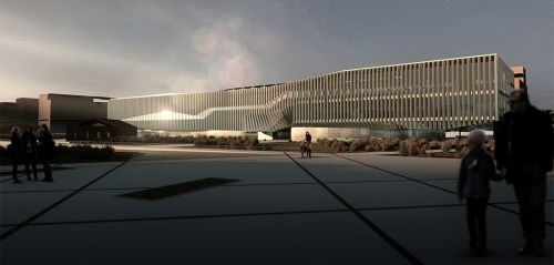
In that regard, the building offers elasticity and versatility, achieved through the employment of two sets of ramps–a simple resource that produces a double-helix organization a hyper-linked space, breaking the hierarchies of common public spaces and providing a non-linear experience where incidental and accidental encounters occur between the users of the library, increasing the chances for new affinities and ultimately the production of shared knowledge. This is further enhanced by a series of seating steps and walking stairs between the half levels that can offer casual configurations for individuals and groups to find their own space and gather or to connect to another area of the library.
The library works like a machine to alter, mutate and adapt to changing usage patterns and optimization processes. This process would start with extensive user participation and consultation during the design process and would continue perpetually. What has been drawn here is just one version of limitless different possible arrangements and combinations that stem from the ‘hyperlinks’ of ramps, stairs and the array of vertical cores
The contrast that emerges becomes articulated in the variegated façade, made by combination of glass and white-steel. The library turns visceral, generating different light conditions and spatial qualities without the conventional compartmentalization of space. Through these moves, the new library becomes the living room for the city, creating a sensorial experience from façade into plan, where light quality guides the user both inside and out.
Generate a seamless connection with the surrounding public space, the ground floor of the library has been given as much transparency to let people to visually and physically cross through. The structural design follows in a logical and rigorous manner from the internal organization. The building floats above the ground, primarily supported by a series of concrete cores and columns. These partially support the slabs, which will receive additional support from being hung off the roof grillage by a 5m-spaced series of flat steel members. Likewise the central ramps are hung off from 1m-spaced series of cables that form sculptural weaving curtains which scatter light into the surrounding areas. On the other hand, an opening has been produced in the roof to allow for a public terrace, which becomes another means to connect people with their city.
Fluxo rosa - Morelia, Mexico
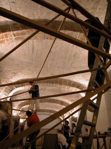
Fluxo rosa (pink flux) enhances the threshold condition of the colonial colonnade by:
1. Undermining its linear perimeter with a continuous zigzagging surface that re-establishes a physical relationship to the contiguous plaza.
2. Closing-up at first instance the visual connectivity and then opening-up specific pinholes in the base of the cones that describe the precise axis between windows in the north side of the gallery and the larger openings in the south wall.
Transgressing the boundary between inside and outside, fluxo rosa remains ambiguous in creating a dialogue between the existing traditional spatial concept of repetitive spatial modules and its own continuous variation. It invites for exploration and discovery of the differences in light and spatial conditions along the length of the space and throughout th
Crumple zone - London, Uk
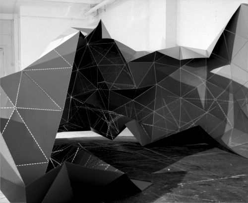
Bypassing the typically linear process of design followed by construction, and reversing traditional skeleton structural systems plasma studio programmed a pile of standard industrial sheet steel with information in the form of perforated seams. As in recent automotive strategies, the seemingly weakened material organization enables a formation of global stress distribution lines achieving a different kind of structural performance.
The sheet material turned form through the negotiation of overall curatorial organization, the site and structural form-finding. Still, it mirrors traditional architectural works in expanding from the subservant function of providing surface and backdrop for the other exhibits to its own inherent discussion.
While the piece is derived from a rigorous set of proportional relationships, these merely differentiate the material consistency to direct the reciprocal forces within the process of production. A contemporary aesthetic discussion stems from the embedded interrelationships, the sensuality of forms liberated from straightjacket cartesian rules and its weightless appearance.
Contingent affiliations - Beijing, China
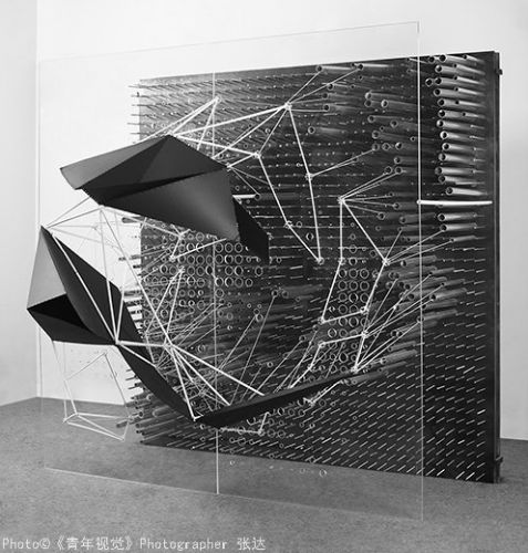
It emphasizes the two primarily different characters of the original entities and the transformation that both can undergo when submitted to mutual interaction. Such transformation has a formative effect in that it surpasses the individual changes of the one to become something of yet another realm; a reinvention of the two through a conjoint projection. A viewer will be first and foremost thrown off-guard by the scale of this installation: in-between an employable structure and a representational model, it raises a series of elementar questions in regard to representation and experience of space. More than a wall, this sculpture employs depth in an ambiguous manner, expanding and collapsing space simultaneously. Absence of materiality in the combination of monochrome black and transparent plexiglas, eliminating any trace of making together with a systematic yet ultimately abstract and non-referential morphology all work together to create a sublime experience and a unique object.
The final object is an abstract machine which expresses plasma studio modus operandi; the partners creative process, a way of working, creating and inventing new narratives indistinctly of its scale -urban planning, architecture, installation, interior design or furniture.
Drape - Tehran, Iran
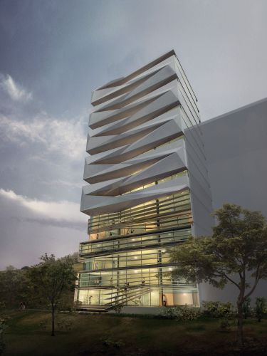
Hence the repetitive nature of identical residential plans within a high rise results either in repetitive horizontal banding, excessive glazing or arbitrary formal escapades.
For this 16 storey condo development concept, we propose a rigid internal corezonen and systematic structural grid that then frees the north and south façades to express movement. In order to make complex façade elements at a feasible cost we devised a geometry that relies on a single set of moulds that can simply be turned around every second level. Using double-curved bands rhythmically is a pragmatic solution that combines the economy of repetition with an exciting and animated visual appearance.
The façade design engages with the social and cultural context in providing various degrees of visual openness and enclosure so the zones behind can be occupied in accordingly.
Firestation vierschach and mühlbach - Bolzano (BZ)
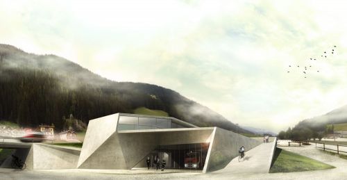
Roofscapes and access ramps fold to mimic the gesture of the flanking mountain range, accommodate the strict ceiling height requirements, and offer south-facing terrace spaces for public gatherings. The functional strength of these proposals lies in this vertical separation of the public/leisure spaces on the first floor and the fire station program at ground level.
Deep ground - Longgang, Shenzhen, Pr China
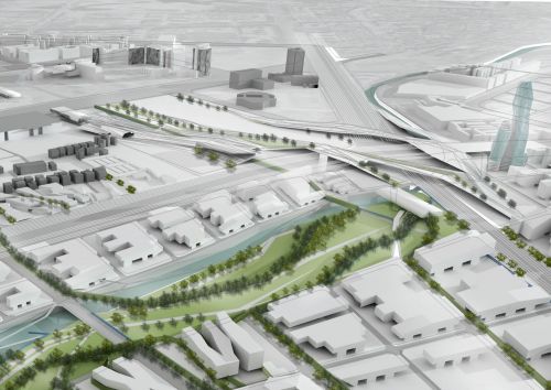
The project deals with the regeneration of 11.8 km2 of the urban fabric in the centre of longgang, north east of shenzhen in the pearl river delta, with estimated population of 350,000 and 9,000,000 m2 of new development. The project radically expands the scope of urbanism in order to deal with the contemporary challenges of modern china: through the concept of ‘thickened ground’ multiple ground datums are fused to foster intuitive orientation and connectivity. The polluted and neglected river will become an ecological corridor, whilst the existing urban villages are retained to form nucleuses to lend identity, vitality and human scale to the new development.
Sungang 14th subunit - Shenzhen, China
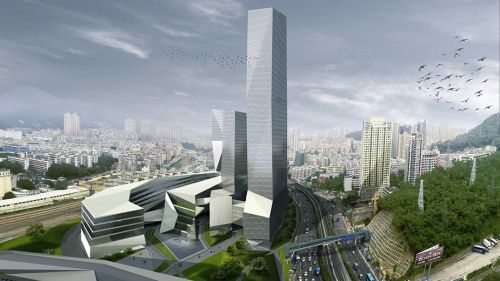
1. Clustering, folding and symbiosis:
Through the use of folding, they have been created clusters with high efficiency in between the bounds of architectures and landscapes.
2. Three dimensions of vehicle traffic and 100 meters pedestrian system
Combining the major traffic road with a series of auxiliary transportation secondary system, the traffic will be efficiently redistributed and the 100 meters pedestrian system will satisfy the need of pedestrians for fast and convenient travel.
3. Hydrophilic space with open spaces
As the main landscape focal points, the two main hydrophilic space and three open spaces with being able to catalyst the livability of the surrounding areas. Therefore, the five open space will offset the loss of public space in this area, and providing an enjoyable place for the people.
4. Creating new ecological landscape languages:green fingers
The concept of the green fingers (ecological corridor) is different from the indifference grid design methodology. By expanding the urban structure, the green fingers are able to provide a series of green public space, by rising the quality with their various recreational activities.
5. Creating a commercial landmark
In this site, the architecture is as part of the landscape expansion. The architecture structure is used as a thinking ground, to archive a multi-layers ground concept.
Ground ecologies - Jiading, Pr China
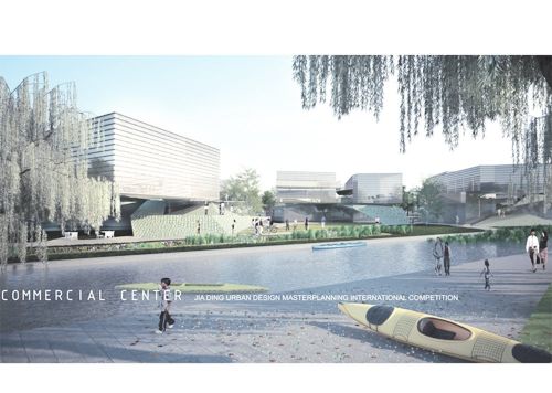
The site is located in the outer area of shanghai city and is part of the greater master plan of the city to develop peripheral new districts that can cope with the rapid urban development and the need to provide residential zones with direct access to the centre.
The competition called for the transformation of the industrial site into a high dense residential area boost by the newly open metro line station in the border of the site and a highway that ensure direct and close connections to the centre of shanghai, allowing jia ding to become an important local centre in the near future.
The project inception is based on the local ground conditions and its transition from being a heavy industrial site into a new high dense residential district which includes business and commercial zones. The challenge was to integrate the necessary techniques a methods to prepare the ground for the future development with the residential, commercial and business programmes.
The structure of the project was lay out using 3 different engineering techniques: soil remediation, water treatment and traffic and street system.
This 3 different techniques were intertwine in order to create a basic framework from where the new programme can be introduce. The potentials and possibilities that a new a clean canal system, a new ground configuration, and the reorganisation of the street layout, were used to generate a project with a new ecology that can create a sustainable diverse and inclusive community.
Deichmanske library - Oslo, Norway
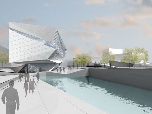
With fluent circulation, the new library creates a continuation of the city’s commons through increased accessibility, permeability, and transparency within architectural space. Employing a variegated facade, the library becomes animated, generating different light conditions and spatial qualities without the conventional compartmentalization of space. Through these two crucial moves, the new library captures the fluidity of the harbourfront, creating a sensorial experience from façade into plan, where light quality guides the user both inside and out.
The new deichmanske library creates a new kind of space that speaks to the notion of “agora”, focusing more on the services needed to generate local specific knowledge than on the ubiquitous, global information. The building offers elasticity and versatility, yet is composed of comprehensible space. This elasticity is achieved through the employment of two systems of ramps – a simple resource that creates a hyperlinked space, breaking the hierarchies of common public spaces and providing a non-linear experience where incidental and accidental encounters occur between the users of the library, increasing the chances for new affinities and ultimately the production of shared knowledge. This rather simple distribution of the library, divided into three zones connected by the ramp system creates a radical, novel space that attracts citizens whom previously would not have been interested in a library.
Aquapark tomsk - Tomsk, Russia
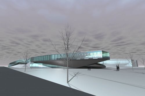
Inspired by the surrounding landscape of subtle undulations and changing seasonal appearance, we opted instead for a building that is characterized by a dialogue between its tropical interior waterscapes and the frozen context.
This approach goes beyond the familiar escape into a tropical paradise; it choreographs the experience of both worlds side by side, intensifying through juxtaposition, more akin to the contemporary virtual reality of zapping through tv, choosing an eclectic soundtrack on an ipod or flying from moscow to crete in less than 3 hours.
The project offers glimpses of the external reality as if through eyes fluttering in and out of a daydream. When sipping a pina colada on a deckchair next to the pool, the tundra has never looked so good.
Elastic meshwork of parameters-the project was developed using a parametric design strategy that overcomes the unilateral and inflexible scope of a traditional architectural proposal. This approach enables new variables and changes to be incorporated in the generative design process, whilst retaining an overall conceptual coherence.
Index of flows and activities-much like natural formations, the project's morphology is shaped, in-formed and differentiated by processes. Movement becomes both a witness and active stimulator of further activity.
The result is a spongy tissue with a series of outside pockets that introduce the reality of the siberian climate as snow-filled 'exponents' within the tropical reality of the interior. It is topographically organized with water chutes carved into the undulating ground plane rather than floating in the air. Hence the spaces are organized and experienced as landscape, inviting exploration and discovery.
Biomedical research center - Giessen, Germany
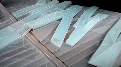
There are traces of a victorian bourgeois suburban pattern offset by large scale state authority buildings. In the seventies, the area was organised around a linear infrastructural spine consisting of a private street with a massive subterranean distribution channel running next to it. Both these structures are underused and their purpose of fostering an extension towards the south has been defied by the preparation for new suburban housing.
We developed a web of local relationships that inform the new masterplan in order to reestablish a genius loci from the ground up rather than placing objects on a blank slate. In this same vein, we used the site's height deviation of 14m as a generator for the building strategy.
From the onset of design, the project evolved as a series of low linear buildings. In this way, we avoid the construction of a single volume in favour of a pattern that follows the landscape. It provides for permeability and integration with the existing framework of flows, whilst maximizing the impact of natural phenomena such as wind, weather and seasonal changes between the artificially controlled lab and research environments. In broader terms, the outside world serves as a constant reference and arena for the purpose of research.
In the second phase, the need for a central entrance from which all spaces could be reached was introduced. Our initial concept favoured quite the opposite: decentralizing the different institutes as individual volumes, separated by corridors of landscape. Rather than starting from scratch, we performed a series of operations that moved the strands closer together, enabling them to connect and overlap. This was followed by weaving, folding and interlocking buildings and landscape; inside and outside flow into each other whilst retaining the necessary differentiation between public, semi-public and secure circuits.
Process of affiliation-a ductile mesh developed from internal/external circulation patterns and building volumes produces a matrix of interrelationships that enables everchanging frameworks and environments for tomorrow's high-tech scientific research processes.
External knitting: buildings and landscape-at the ground floor level, the centre is accessed through a landscape of fingers that bifurcate and twist to form the main lobby's floor and roof.
Internal knitting: threads and nodes-the first floor level contains a connecting spine that runs perpendicular to the institutes and connects them. It is woven into the buildings and the external landscape in three dimensions. Inspired by genetics, we developed several techniques to increase complexity and relationships between the different strands and institute blocks. At the intersection of two buildings and the connector, knots appear. These become vital social recreation and exchange areas. Moreover, this fosters a crossover between the two different institutes that share one such area.
Moritzburg art museum - Moritzburg, Germany
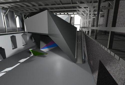
The competition was launched to develop a new extension located in the upper levels of the west wing ruin, combined with a reorganisation of the existing spaces.
Plasma studio urban strategy sought to increase the porosity of the fortress; which at the moment can only be accessed by a bridge. Two additional accesses were introduced to encourage circulation through the castle, strengthening its connection to the city fabric. The castle stands out as a collection of parts, each incorporating the technological and cultural tools of their respective period. Following that tradition, we developed a structure that sits on top of the existing medieval cros vaults and incorporates their structural scale, but that is rendered fully contemporary in its material organisation (i.e. Steel) and beyond. It is parametrically derived and controlled–not a finished product, but a dynamic armature that can respond to a variety of factors and be calibrated to meet the delicate heritage demands of the old castle.
Link of the city - Kufstein, Austria
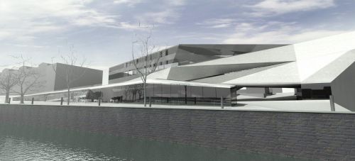
Plasma studio proposal stems from the ambition to develop the new volumes as connectors between disparate parts of the city. The building starts as the extension of a new artificial landscape next to the river and forms a bridge over a street that dissects the site. It then turns into a passage through a restructured shopping centre before merging with one of the main city squares.
This results in a morphology that hybridises the various programs and fosters rich relationships between them as well as with the external conditions.
Fusing with the landscaped riverfront, the building extends to form a bridge. Beneath is the access to a theatre, cafe and meeting facilities. The bridge leads to a public passage through a proposed department store, connecting the river with the central area of kufstein.
Mies 2.0 - Kuala Lampur, Malaysia
While the overall ecological footprint of such an endevour is flawed per se, it was an opportunity to rethink the boundary conditions between inside and outside in a climate that is all year round hot, humid and uncomfortable.
Through intensive sessions with environmental experts at arup, we decided that the attractive low-tech solution of cross ventilation, high spaces and permeable architecture would be unrealistic, as the proprietor of such a villa would simply stick in an airconditioning unit to sleep soundly at night at least. Hence for the two sites we developed two distinct machinic buildings that have been intrinsically shaped by the extensive employment of photovoltaics and insulating the interior well from the hot and humid air outside.
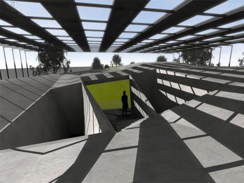
The proposal for site 03 shown here uses its relatively square site to develop as a centralist cube that is shielded by a c-shaped bracket of shading elements and photovoltaic panels. The roofscape beneath is sculpted to collect rainwater into two concrete cones where it is filtered, stored and distributed for various uses in the house. The circulation wraps around those two volumes and claims the space in between as a meditative space that constantly changes with the path of the sun flickering through the pv roof. The spiralling system of internal ramps find their continuity in the landscape that is shaped to provide access from underneath the cube. All living areas are contained by one open l-shaped space, while the bedrooms and bathrooms are complementing with another l to form the complete ring. When moving between these, the user transgresses a climatic threshold as the corridor access to the bed and bathroom as well as to the roof is already in the outside. The external façade continues the subtle sectional lines of the topography and the roof edge as two more undulating lines that limit the use of glass and hence provide additional insulation and thermal mass. Though at first the project appears to be in the tradition of the classical miesean approach as a seemingly universal glass house, specific response to the sun path, climatic demands, shading and the engagement with the ground are all turning this into a contemporary responsive, contextual and sculptural experience.
Silversmith - East London, Uk
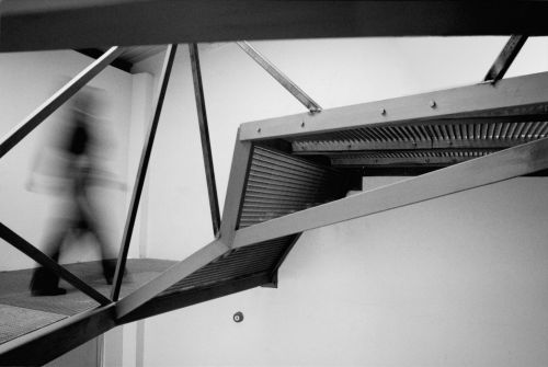
Made from industrial steel grating that at once transmits and deflects a large amount of light, the upward spiralling surface is guided and structurally supported by a truss structure that acts as balustrade. It offers a continuous succession of areas , each ones tasking a different activity, yet with no clear definitions. Conceptually stretching the boundaries between work and live, cook and sleep into transitional zones , this structure offers the experience of a seamless , viscous unity.
The ascension of a user through the continuous spiral trajectory produces a gradual shift towards increasingly private and personal spaces.
The new spaces occasionally also need to serve as a gallery for the display of the clients crafted pieces . Visitors move upwards while examining the work at gradually progressive stages until reaching the final treasures that are displayed directly underneath the sky [light].
Hence ironically, the complex forms of the proposal, which emerged from a seemingly straightforward and functional brief, echo the social and religious concepts that inform the tradition of our clients ‘ millennial japanese metal craft.
Oceanographic museum - Stralsund, Germany
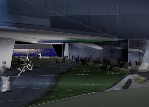
Treating the site as a connector device between the two different urban conditions we formulate the building in its circulation, program and materiality as an open, porous volume, with multiple accesses informed by the main external attractors.
Influenced by the "klein bottle" concept (a moebius strip turned container with only one surface) we developed a strategy that folds the open public space through the building mass.
We propose a non-hierarchical system of interlacing topographies that start articulating differences throughout their pattern. The three-dimensional spatial network hence results from the interweaving of this artificial public topography with the unfolding program. This interstice space subtly rendered into different degrees of desired openness. For instance, the circulation to the museum entrance develops as choreography of relationships, vistas and emphasis on the horizon line, whereas the access itself is undermined as a point of control and contrived as a momentum of smooth transformation placed in the existing warehouse. The museum program unfolds wrapping above/beneath and from within the public artificial landscape in a continuous loop.
The resulting space topologically exceeds traditional limits and embodies the seamless ness and vastness of the ocean.
The built mass operates as an all-inclusive, viscous matter: it is no longer possible to isolate independent systems or establish differentiations between its parts. The specific requirements of exhibition viewing dictate the circulation, which varies in size and movement and informs the building itself.
Lighting, views, flow and spatial definitions and transitions are all generated and controlled through this warping continuous surface that incorporates the exhibits, aquariums and technical services.
This new dynamic compound alternates various internal and external forces and relationships- it embodies the demands of an oceanographic museum as a mediator of the fluid, complex and constantly moving underwater realm.
Barcode house - Ascot, Uk
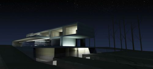
The result is a constructivist composition of elongated volumes that sit on top of each other or intersect. This composition embraces the exterior space thus producing a rich variety of different spatial conditions whilst enabling the programmes to be ideally located.
A barcode pattern was used to further differentiate parts of the external skin along the paths of movement. From its autonomous self-referential organisation the building expands outwards, altering the steep slope in which it sits to form a new artificial landscape that blends the natural with the man-made.
Transpositional practice - London, Uk
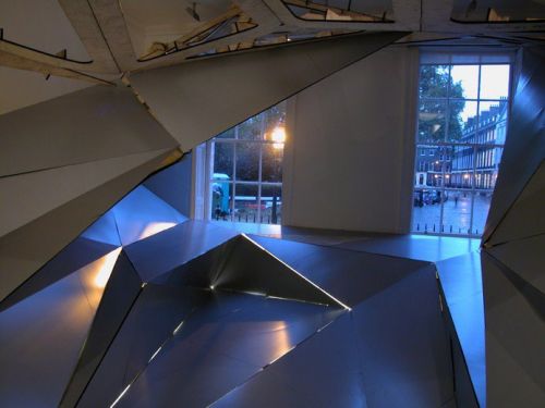
From grafting a part of the lobby of hotel puerta america into this host space and then growing the tissue to tie into the existing classical georgian organization, the new compound ties closely into the fabric of the gallery.
At the same time the inserted space becomes a sublime encounter as artificial cave. A single surface drapes the entire space- it morphs from a box shaped section that describes the windows to bedford square to the interior cocoon that has been transposed in its original geometry from hotel puerta america.
The project discusses through real physical experience how we read, interpret and occupy space. Since no semantic clues are given as to where to walk, sit or look at (floor, walls and 'seats' are seamless), ,it needs to be 'conquered' and creatively claimed by everyone in a personal way.
'the brain is a biological forecasting machine. It follows that its pleasure consists in taking gambles. And it can only gamble on a reality in motion, ever changing. Shape, even motionless shape, is an opportunity for mind shifts, for imaginative changes in direction, which criminal architects would prevent us from enjoying.' alain berthoz
Without an established micro-identity to call on, perception is thrown into an intensive response to raw sensory stimulus. Poised on the threshold of the corridor we hesitate as we project a future path through this space and anticipate its outcome. The unfamiliar presents itself as both a threat and an opportunity on this first encounter. If we cross the threshold into this space we then open ourselves to the pleasures of the ‘mind shifts' and ‘imaginative changes in direction' that it offers. We begin to self-shape those sensorimotor patterns and micro-identities that allow us to respond to the space's rhythms, repetitions and reversals. Gradually, through the criss-cross of brain, body and environment, we establish a meshwork that joins neural and architectural topologies within a singular kinaesthetic dimension; resistance breaks down as experience opens up.
Written by douglas spencer
Urbanite - London, Uk
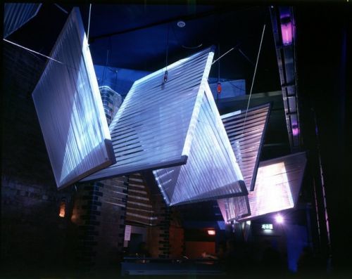
For architecture week, the do-group initiated a one night event/installation at a nightclub venue in shoredich, east london with the theme urbanite.
Three-dimensional projection
Movement, rhythm, time lapse...
Neutral captured movement as the essence of london in their cinematic analysis of public spaces. Traffic nodes, train journeys, vehicular movement, people walking–everything is in a constant flux.
This is further elaborated by the speeding up and slowing down of various sequences. Projected from either end of the room, the images flicker through the whole space, caught on the screens that meander rhythmically in-between.
The screens are covered with bands of semitransparent film–acting as surfaces capturing the images while at the same time filtering partial images through to the other side. The panels in the middle present a blend of images from either side, embodying notions of colour and movement. The experience conveys an ever-changing degree of intensity within the spaces.
Nodal landscapes - Berlin, Germany
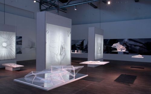
Within a site-specific grid arrangement of nine light boxes covered with technical drawings, nodal landscapes has been conceived to immerse visitors into plasma's systemic approach and its preoccupation with grids, ground and context. A plethora of conceptual and presentation models float loosely in-between and enable the visitors to spot and identify recurring aims, ideas and their spatial and phenomenological effects. Deliberately sparse explanatory material and noted lack of 'overview' and 'analysis' underline the intention to foster an active and personal engagement with the related effects and affects- a kind of neorealist stage-set aligned to our own sometimes abstract and dazed mindset between shapes and numbers.
The processes are seldom the linear progression from sketch to build structure- likewise there is no hierarchy: current work in china is shown as large renderings, photos and technical drawings with an emphasis on conceptual and presentation models. One wall is covered with photos of built european work where most of the concerns and concepts are already present.
Naturalizing architecture - Orle'ans, France
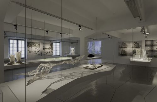
This 2013 exhibition, titled naturalizing architecture, is concerned with the many different interactions between architecture and science. An exhibition in an area of 1000 sqm, a publication, and a series of events introduce the research projects of 40 young architects, designers, and international artists.
Digital models, maquettes and projections, interactive environment, and pavilions designed for the occasion all present this outstanding area investigating in spectacular ways.
As for each previous exhibition, archilab applies an approach involving information and awareness, conducted through visits and workshops, which enable every kind of public to discover architecture in its most innovative aspects.
Critical territories - London, Uk
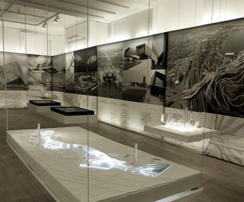
The installation – a site-specific grid arrangement of light boxes covered with technical drawings – has been conceived to immerse visitors in the systemic approach of the practices and their preoccupation with grids, ground and context. A range of conceptual and presentation models floating loosely within this grid communicate recurring aims, ideas and spatial and phenomenological effects. Among the projects on show there is the xian international horticultural expo and the longgang masterplan (deep ground project).
City fringe park - Zhuhai, China
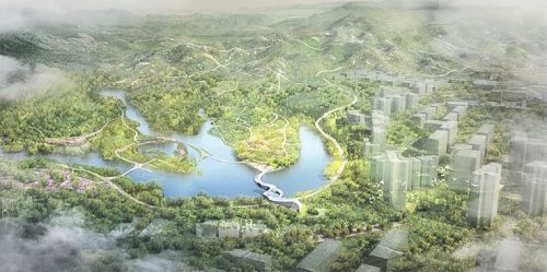
Phoenix mountain botanic garden: a botanic garden is embedded in areas within relatively gentler slope, along with the interwoven water-system and ancilliary slope-based activities. Water bodies on site (mainly fish ponds) were treated and partially connected under the concern of ecological and spatial improvement, while enhancement as buffers by-side were naturally attached. The coverage of the transitional layer, on one hand, provides protection to sensitive areas, and on the other one, brings core activity areas that were carefully located.
Xiangshan lake park: mainly addressed to families, the natural identity of the area is kept and easy-to-access social functions are introduced, especially for children.
A hierarchical organization intensified and tied up activities in certain areas, while to others, less flavoured or kept raw, and therefore, brought a pattern of different levels of development. Conservative and reserved development in some parts show care to existing resources that require a more delicate touch of human, otherwise, layers of activities could happen simultaneously to different groups that target different purposes. Proposed activities enhance experience pathways from mountaintop to the lake centre, include viewing, hiking, gardening and boating etc. All together, intertwine nature to human experience by introducing multi-layered linkages through one activity to another.
Cultural park: for this area, outstanding features of fenghuanshan are emphasized and improved to enhance the experience of nature. The creation of a connective system with paths that come together and branch out, developing linking spots designed for different users. In order to make accessible the steep hills in the south part of the park to as many people as possible, the path network in this area was divided into 2 ranges, from 0% to 8% and from 8% to 20%. The former for all ages and the later aimed at sportsmen, respectively. Considering a low invasive, impacting intervention, new activities are offered, as well as the improvement of the existing vegetation system. Led by an ecological strategy, existing and proposed water bodies become a physical/natural system of interconnections. The activities of this area encourage an educational exploration of the landscape.
Adyland amusement park - Krasnodar, Russia
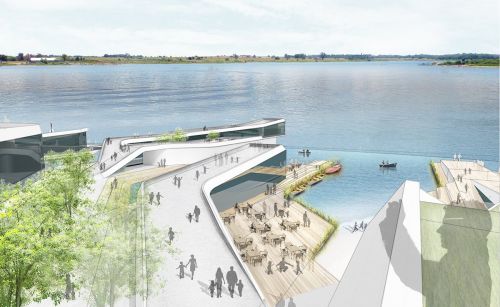
Inspired by the roller-coaster dynamic rides, the movement guides the transition from the parking, through the hotel and into the fishermen village piers.the green facade of the parking generates a pedestrian promenade which leads pedestrians safely to the entrance of the park through a green intertwined surface. The design of the fishermen village follows a fishing port configuration with its pier like structures that aims to create a highly interactive environment between waterscapes and people through a variety of programs. The hotel maximizes the view with its terracing facade towards the lake and it becomes the backbone of the four piers and performs as a threshold of the village from the parking. The four piers host a conference center, its section sinks into the ground, allowing views from the amusement park into the piers serving also as an open air theater with a floating scenario for open air events, a café with outdoor sitting areas in close contact with the water, a table service restaurant and a restaurant that intertwine as fingers crossed generating a pond courtyard in between them and a fast food, sunken down to emulate the relationship with the water that one experiences inside a boat.
Celestial fabric - Dubai, United Arab Emirates
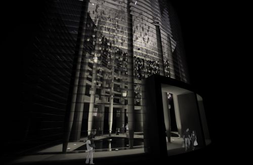
Today, the burj khalifa has achieved the seemingly unachievable, climbing higher than any building in history. But while this technological feat has been realized, the stars above remain unchanged. Celestial fabric brings five heavenly bodies down from the skies. As the system ascends through the lobby, paths multiply to create a dense network of shimmering lights that seem to continue to the heavens.
Celestial fabric is an interconnected spatial network consisting of mirror-polished stainless steel components hanging in a cable-net structure. The cables hang from a complex geometric net generated from two-dimensional islamic patterns, rendered in three dimensions within the vertical space. The sculpture connects to the lobby structure at five points, while cable strands descend and connect, terminating at five points above each reflecting pool. This branching network allows for both spatial complexity and maximum structural efficiency.
The component design is generated from a series of pentagonal geometries–reinforcing the importance of the number five in islamic culture. By combining a series of two-dimensional pentagons into an extruded three-dimensional form, a singular element is designed with a specific geometric rationale.
With fabrication in mind, each module can be folded and joined in groups of three, where complex crystalline patterns emerge.
Lighting is fully integrated with each element containing a light source that is supplied and controlled individually via the cable network–enabling fluctuating, complex effects and ephemeral patterns to animate the space.
Schwarzenstein huette - Trento (TN)
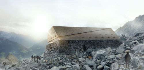
With the design of the schwarzensteinhütte mountain hut, we have consciously decided to create a building that appears, at first glance, to be part of the surrounding landscape. In keeping with nearby residential communities, the volume was turned up slightly to catch southwestern sun, energy, and views of the valley and former refuge hut.
The new hut stands high, higher than its predecessor, not in an imposing way, but rather as a visually integral part of the local mountain range. A rock-based pedestal emerges as a continuation of the natural topography. The prefabricated structured is wrapped in a wood shingle skin. Weathered over time, the refuge’s facade will disappear into its environment.
The volume remains simple in its form, yet different from every angle. The building steps back to create a protected entrance to the main floor where views can be enjoyed behind a glazed facade. On the upper levels, small openings in the facade communicate a closed, rock-like aesthetic.
X-site - Venezia (VE)
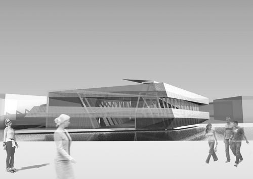
Through an extension of the covered plaza beneath the building into a system of two helical ramps that constitute one continuous loop, the public circulation within the site is brought up to the first floor and roof level.
Following the concept “del fare un giro,” we created a three-dimensional promenade which leads through our site and enables a continuous walkway through, into, up and down the whole building. This ramping system embraces the different retail and club spaces, and turns them into transitional zones on each floor.
The structure was devised as a series of steel frames that weave through the volume and underline the russian doll or onion principle with the inner core being the dancefloor and ancilliary programs arranged in layers around it. Perforated sheet metal is used to materialize these wrapping layers as translucent veils, enabling rich and fluctuating optical effects and ambiances.
Ggantija world heritage park - Gozo, Malta
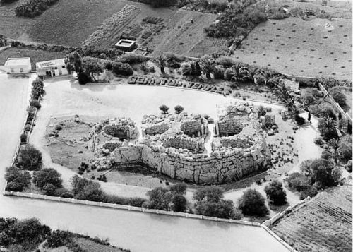
The pavilion is meant to prepare visitors for the deep spiritual experience ahead.
The initial concept was to submerge the interpretation centre into the site and nestle it into the trees. This strategy combines the landscape and the history of the site into a hybrid public cultural garden, acting as a node which promotes the rich heritage found in the xaghra vicinity. This hub could house temporary exhibitions and events, offering added value to the ggantija temple grounds.
A second design decision can be observed in the way that the interpretation centre opportunistically weaves through the open spaces between trees, exploiting the naturally cooler temperatures and shading. The building camouflages itself within the existing landscape of foliage, delivering an intervention that is integrated with the landscape.
The pathways act as multi-sensory corridors of sight, sound, smells, textures and tastes. At shaded intersections, the landscape typology shifts from the exhibiting rhythm of display into a moment of rest and tranquility. The paths extend the concept of the timeline into the landscape, taking the visitor on a journey back in time, enhancing the archaeological experience of the site, and allowing the visitor to gradually soak up the landscape and acquire a greater understanding of the temple. These nodes become information points, visual aids, illustrations and a more informal approach to hands-on interaction.
The interpretation centre houses ticket booths, an auditorium, a children's centre, and a flexible exhibition space. As one progresses through the interpretation centre, the physical experience of light, shadow, and air constantly changes. The synergy between the location of the building and the natural shading of the trees reduces the need for mechanical cooling systems; however, critical spaces such as the auditorium and exhibition space are climate controlled. Views of the landscape are framed through designed moments. Having explored the interpretation centre, the visitor emerges onto a series of sinuous paths leading to the temple.
The proposed fabric is recyclable, reflecting the proposal’s commitment to sustainable design. This fabric provides full enclosure while also allowing for the diffusion of natural light, creating the experience of interior space while sustaining a connection to the natural surroundings.
The building is made up of a series of steel frames that support the roofing materials, shading devices and walkways. The frames rest on reinforced concrete pads that transfer the load to the rock. Moreover, to protect the rock, a layer of expanded polystyrene is placed as a soft interface between the concrete pad and the rock face. The walls and roof of the audiovisual centre are made of an insulated sandwich panel that spans between the main and secondary steel frames. The other spaces are roofed and wrapped in a high performance polymer fabric. Portions of the walkway are shaded by extruded fiberglass sections, which are used to give shade, reduce maintenance and provide support for the growth of creepers that will wrap the building over time.
Dalian diamond tower - Dalian, China
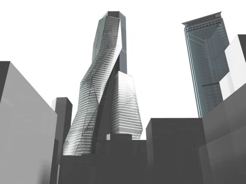
Plasma studio proposal wraps a new skin around the existing floor plates, which extend to adopt a new morphology in harmony with the context. The expanded internal volume will assist in a more functional distribution of the various programs.
The extended floor plates are carved by a tessellated mesh of air shafts for energy-efficient climatization and social connectivity.
The design strikes a balance between a commanding visual appearance and identity, and a subtle, clean and receptive quality.
Picture art house - Bressanone (BZ)
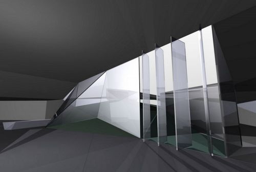
We opted out of creating a separate, solitary object in favour of using the proposal to reorganize the complex as a whole and to communicate a new, dynamic image.
The existing parking lot pattern and other structural demands were translated into a grid that was then collided with the desire to retain as many existing trees as possible. The irregularities within the tree pattern induced deformations and disturbances, establishing a new identity that is far richer than the existing orthogonal, mechanically-driven factory and parking patterns, but that is still intrinsically intertwined with them.
The new pattern was then reprogrammed with parking spaces, pedestrian routes, artificial landscaping as well as surfaces for the display of durst's outdoor products. Experienced from the motorway that passes above, the new intervention performs as a large-scale fluctuating graphic image.
Spatial and programmatic organization
In order to connect the new picture art house with the existing factory, we proposed a shared entrance.
Whilst this enables an efficient coordination of staff and resources, more importantly, clients, visitors and staff will be greeted by a spatial experience that stemmed from a rigorous play with perspective, horizon line, and ever-changing vantage points.
The picture art house is organized as a continuous loop that unfolds along internal and external spaces as gradually changing volumes, proportions and directionalities produce manifold fluctuating visual relationships. The trajectory of the main exhibition stretches between the external space in front, into the foyer, through a dedicated gallery area, out into the courtyard and back into the foyer.
In this manner, the traditional boundaries between inside and outside are replaced by a dynamic oscillation that connects the two realms.
Invia una richiesta di lavoro a Plasma Studio
Trova i migliori Architetti a
Roma| Milano| Napoli| Torino| Palermo| Genova| Bologna| Firenze| Bari| Catania| Venezia| Verona| Messina| Padova| Trieste| Taranto| Brescia| Parma| Prato| Modena| Perugia| Ravenna| Livorno| Cagliari
Vedi tutti
Trova altri professionisti a Sesto
Architetti| Imprese Edili| Imprese di Impianti Elettrici ed Elettricisti| Imprese di Traslochi| Imprese di Ponteggi| Imprese di Costruzioni Ecologiche| Ingegneri Edili| Imprese di Tende da Interni| Imprese di Bonifica Eternit| Rivenditori di Arredo Giardino ed Esterni| Rivenditori di Camini e Stufe| Rivenditori di Cucine| Geometri| Rivenditori di Illuminazione| Rivenditori di Arredamento| Rivenditori di Pavimenti e Rivestimenti| Fotografi di Interni| Rivenditori di Piscine| Designer di Interni| Artisti| Imprese di Tinteggiature| Parquettisti| Marmisti| Imprese di Impianti di Climatizzazione
Vedi tutti
Architetti vicino a te

