Plasma Studio
Resort & chalets jasna’ - Jasna', Slovakia
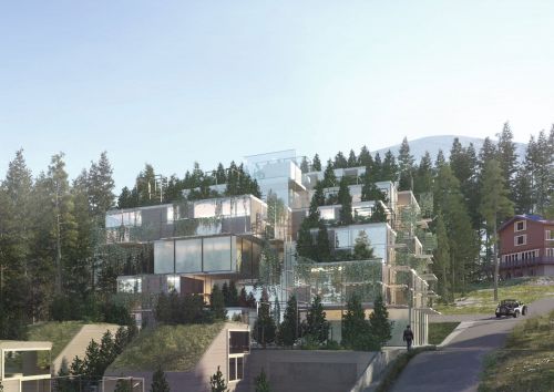
The site is located in a special and beautiful valley, and the intent of the design is to protect and to increase the quality of context of the existing natural environment with addition of the designed architectural solution.
The plot, subdivided in two different portions, has the unique characteristic to be surrounded from the high trees of the forest, and it has a strategic location for his closeness with the ski lines, with the public bus transportation and it is easily reached by car.
The strategy has been to start with the creation of a system of components, modular.
Those blocks can host perfectly the four different apartments typologies requested, and also important functions like services, circulations, parking areas and common utilities for the users.
For this specific plot, it has been set up important guide lines to follow up in the process of adaptation and creation of the design building from the starting system.
From the analysis have been understood important key points like:
-integration with the surrounding forest with the technique of the camouflage;
-creation of contemporaneity, high quality architectural language;
-flexibility and possibility of future changes and dialogue with the client.
Kfas headquarter and conference center - Kuwait City, Kuwait
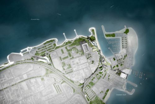
The urban design concept is based on recomposing and connecting, whilst fostering key moments from within which future growth can occur. We conceptualize this urban fabric as a tissue in need of further material definition to generate a strong identity; its own character informed by both, the architectural instances (de)marking places on the one hand and the movement of pedestrians, which in due time will lend itself to additional activities and further intensification of the area.
The kfas headquarters is formed by three basic elements; a plinth, a vertical block/tower and a 0 level plaza.
The plinth forms by decreasing its height and giving space to the neighboring building, whilst lifting its northeast corner to mark its presence more fully in the plot. Instead, toward the southeast it folds down to gently welcome users, inviting to ascend toward its top surface and reach the viewing plaza, where an unobstructed vista opens toward the entire gulf area.
The two volumes of the tower are sharp edged and connected by a central void that runs throughout the entire building providing ventilation, light and a variety of spaces for social gathering and relaxation within the offices setup.
This plaza is one of the larger open space instances we propose with the urban proposal to generate a system of shaded spaces able to invite pedestrian movement within the area.
The conference centre likewise the headquarters, is composed also of a plinth – acting as an urban plaza, an overhanging volume and the floating auditorium.
We have purposely played the auditorium’s duality by being formally a very articulated volume, yet austere in the choice of its rendered surfaces; heavy in its all around concrete presence, yet (and even the more) magical in its floaty appearance; single, self-standing and defining singularity, yet malleable in its connective capacity throughout the building.
Ban xue gang art center - Shenzhen, China
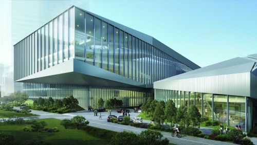
The concept started with the combination of human and nature. Taking the golden mountain park, which is the most important local natural element into consideration. The new configuration has been shaped starting from a parametric analysis of the site, including water runoff, view, traffic and land use of the surrounding area. The aim of the design strategy is to foster the integration of this area into the surrounding with a vibrant, ecological, commercial program on the ground level and a highly social and cultural program on the top, so as to create a new model of the art centre.
Huafa square planning - Zuhai, China
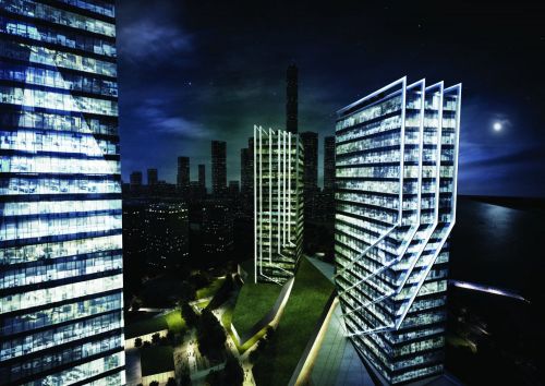
Surrounded by residences the commercial podium will be the main attractor for the population needs. Commercial podium is chronologically the first element encounter by the user. The people attracted by this series of monolithic volumes, would start moving towards them. They would have gradually the feeling to become part of them. This is happening because the flows of people is the element that shaped this geometry producing those cuts. The people by moving in the site would reproduce the act that generated the geometry, over and over again.
Also the elegance of the towers take inspiration from the natural world. A plant that gently climb up by twisting and wrapping around and existing element. The movement is executed as soft as possible, the climbing plant is almost trying to protect the other ones in a maternal hug. In the same way it has been developed a skin system of lamellas that by twisting around the towers embrace them in a gentle movement enhancing the geometry and the verticality. The tallest tower have a more important presence among the complex. For this reason it has been decided to start with a glorious concept of a mineral that grows tall form its own sediment layer. It`s like a rock that become a diamond.
Zhuhai public cultural center library - Zuhai, China
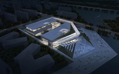
The project is based on the use of a privileged positioning of the building within a corner site, so as to celebrate the various views of the diverse landscapes around it. It has been created the main ribbon, driven by a circulation shaped by the views. It starts in the northeast corner of the site at the last floor all the way till the south-east to create a panoramic platform for the urban frontage of the site; then it starts to descend towards the southwest as it approaches the water frontage and its beautiful views. Finally, it turns around at the northwest corner and it touches the ground level to embrace the landscape and the inner plaza. The green strategy is based on the idea of ‘pulling’ and ‘stretching’ the proposed green running along the waterfront into the site, generating a series of green spaces along with it and anchoring 3 plazas: one internal, more intimate, and two public, facing the waterfront and the city.
The future of brno_architectural - Brno, Czech Republic

This sculptural railway station will be the new iconic gate of the city of brno: its bridge development not only gathers the access to the new high speed line but also enhances the connection to the new neighborhood linking the plaza in front of mala america and the old city with the site.
Located in front of the tram stop, the building includes internal bikes and peripherical car parkings to allow an easy sustainable access to the city.
The second phase goes along with the creation of the university of applied arts: its position in direct connection with the mala america creates a duality of a cultural pole that enhances the existing values and integrates the needs of a new educational space.
Located at a walking distance from the train station in a highly connected site, the university becomes the center of a sustainable and integrated district for students and workers. Its stategic position in between of the old city and the new area makes it a natural extension of the historic center into the new development, integrating the functions and public of the first into the second.
The mixed-use housing typology is based on linear 4 storey high blocks that loosely form courtyards. Reinterpreting and updating the classic block typology succesfully present in brno, they create a distinction between public linear spaces and semi-public courtyards to give a sense of identity and belonging. This basic framework can be calibrated towards varying degrees of permeability and privacy. By the same token the non-prescriptive, generic nature of the typology can be interpreted by different architects in diverse ways to introduce diversity and character. At the same time the highly articulated ground strategy holds it all together with the greenery and a sculptural meshwork of varying paths, streets and canals.
Starting from the same linear block typology proposed for mixed-use housing, the high-end residential buildings are composed by single, double and family apartments. Located at the boundaries of the park, their position gives them a preferential access to the leisure and social activities of the landscape. To protect them from the possible floodings of the river svratka and to create a sense of privacy, their ground is free and sustained by structural elements or landing on the topography adjacent the ponds, creating entrances on different height. Instead of enclosing the private space with the traditional fences, here the use of different paths of hardscape and planting strategies define the property line with a subtle and integrated language.
The third and final phase of the development is driven by the completion of the cultural anchors. After the mala america and the university of applied arts, we introduce the incubator: a multifunctional center intended to connect artists with the public in a spontaneous and social setting. Defined as an extension of the risen railway deck, the topographic roof is divided into two sheds containing exhibition halls, small commercial activities and reading areas.
In the same way that the new train station welcomes the visitors from the city centre, the incubator forms a gateway and cornerstone for the new area from the south.
House h - Dobbiaco (BZ)
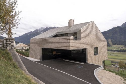
The idea of the project was developed starting from the restrictions imposed by legislation, such as minimized building surface and the requirement of a pitched roof parallel to the slope. The final volume and the concept of the whole project is the result of a subtraction process. Starting with the maximum volume (as derived from given height and surface) certain parts of the volume were substracted to create specific functions; a covered space for parking, balconies protected from the weather, and the terraces in the attic level which introduce light into the house.
While achieving the maximum volume permitted by law, the size of the building is reduced and resulted in a very compact internal circulation. The house is divided into two dwellings. The main house, used by the family of the client, is set over 3 floors. At the entry level there are the bedrooms, at the lower level the living area and kitchen with access to the garden and in the basement the secondary rooms.
In the small attic there is a second apartment, which enjoys spacious terraces obtained from the volumetric removal.
Material
The choice of materials follows the philosophy of reduce, which is proper the entire building. Exterior walls and roof are made with one single material, white cedar shingles, a traditional local material system with exceptional resistance to weathering. Initially pearl-colored, it will over time change into a uniform light grey. The only other material are the glazing, used for the entire height of the openings, and the metal frames and stainless steel edge details.
Particular attention was paid to reducing the carbon footprint of the building by employing windows with triple glazing, controlled ventilation, a heating system with pellet stove and extended insulation with wooden fibers. In the interior lime-based plaster throughout guarantees excellent acoustic performance and moisture control.
Villa drei birken - Sesto (BZ)
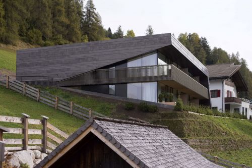
The new extension adds six holiday apartments as well as functional and common spaces. The facade opens through a v-shaped surface from the mostly closed north facade to the completely glazed south facade, facing the sun and the panoramic view of the dolomites.
Although it is connected in the lower level to the existing villa, the new construction is designed to appear as a free-standing building. Perfectly integrated into the hillside thanks to its accessible extensive green roof with integrated terrace, the new volume occupies the full width the plot. It is slightly rotated in order to direct the south facade to the sun and the panoramic view. The joint in the lower level connects the new with the existing building and serves as common dining room. The east and north façades are relatively closed because of the interior’s functional distribution; furthermore, the north side is designed to show the clear separation between the new and the existing building. The volume is accessible from the street side, where also the car parking is located. The six spacious holiday apartments are directed to the sun, with panoramic view of the dolomites.
Material
The new building’s envelope is made of only three main materials: it’s walls are clad with horizontal preoxidized copper sheets of various width while the northern recessed area and the balconies are offset with larch wood strip boards. In addition, full-height glazing is predominantly employed on the southern façade. The larch wood is treated with a pigmented graying solution of iron sulphate, in order to diversify the north service volume. Copper and larch wood are exposed to a natural change of colour caused by the atmospheric influence of sun, rain and snow; this phenomena, in addition to the repetition of the wooden colour code of the villa, further increases the integration of the building into its context over time.
The interior is clear, simple and functional. It contains custom furniture in birch plywood, which is oiled or dark stained so as to be similar to the copper.
Particular attention was paid to improving the energy performance of the building, such as doors and windows with triple glass, controlled ventilation system, heating system connected to a wooden pellets district heating plant and heat-sound insulation with wooden fiber.
Izmir university of economy_ university - Izmir, Turkey
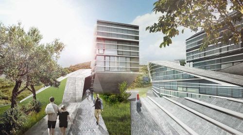
This configuration enables a clear hierarchy and orientation, as well as giving identity to the individual parts while fostering chance encounters and a vibrant communal life.
Additional synergies derive from interspersing semi-public/ leisure activities within the academic environment, so as to create a common strata, to informally encourage social interaction, encounters and proliferation of knowledge across social and disciplinary confines.
The plinth/ or podium_ clustering, a grouping strategy to share the academic facilities, fostering crosspollination among various disciplines. This attempt is substantiated through social interaction by inserting semipublic/ leisure like activities within the academic environment. Transgressing the traditional isolation of the individual faculty, the project proposes a common strata, where the knowledge is distributed ‘horizontally’ through informal encounters among students. The proposal believes in enhancing the built up of novel knowledge, in encouraging the practice of trans-disciplinary research
Hotel a. - Bolzano (BZ)
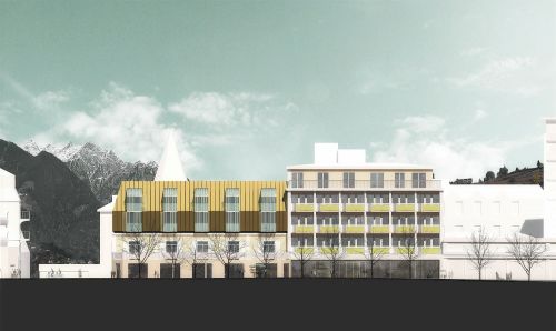
The hotel is located in a prominent position in the center of the city within an important historic context of liberty buildings. The project’s main task is therefore to design the extension without compromising the view from and towards important points of architectural and urban interest in the neighborhood of the hotel. The new addition should not dominate historic surroundings.
At the same time, the project should be a visual continuation of the existing hotel with its fascinating rhythmic façade overlooking a promenade along the river and the thermal baths of the town. The volume of new room’s wing should not be read as a façade but as the surface of a pitched/inclined roof: the new intervention is separated from the existing through a small shadow gap, while a deliberately slightly-bent surface structures and breaks the volume and attracts at the same time the viewer’s gaze. The chosen material for the intervention is brass which repeats the material language of the surrounding liberty architecture as well as the interior of the existing hotel. The new volume takes up the rhythm of the underlying existing façade and translates it into dormer-like glass structures that form balconies for the rooms.
Paramount-alma - Sesto (BZ)
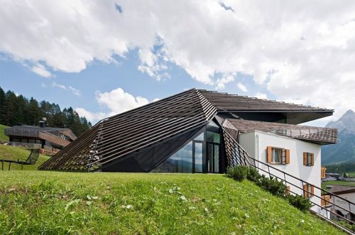
In 2014, to the neighboring residence alma, a guesthouse built in the 1960s, got rid of an underused pitched roof , a previously non-existent vertical circulation and the dwelling for the host family were added.
Due to the immediate neighborhood of the strata hotel, the theme of the wooden stick was readopted: this time, two bands follow the geometrically complex volume, pushing behind and over the white existing cube and joining with the surrounding topography. The interiors benefit from differentiated external spaces, which open up between the building volume and the wooden sticks, light openings provide panoramic views and bring the sky deep inside the building - a variation on the theme.
Strata hotel - Sesto (BZ)
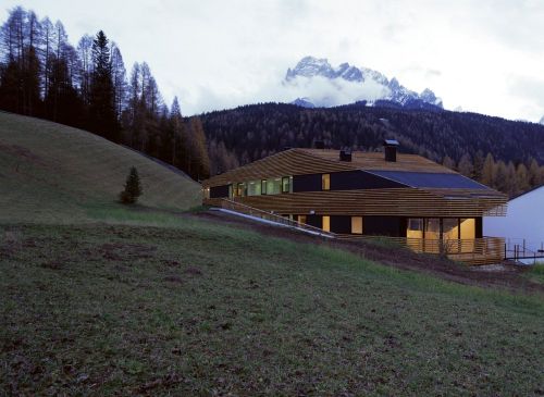
Skin organisation as strata-since the overall shape was in part determined by the local planning guidelines, the linear distribution of units and the orientation of the sun and views, it is a result of the constant negotiation between these parameters, as well as a topological answer to the picturesque typologies frequently built in the area. From applying the logic of topographical mapping, i.e. The indexing of horizontal sections as continuous lines, the volume is formed as a series of strata: an artificial entity in a dialogue with its natural environment.
In addition, these horizontal sections operate as control lines, generating curved hyper-parabolic geometry. The bands surround the volume at different scales, peeling off from it, flowing into the landscape and blurring the boundaries of the building. The balconies become liminal zones that negotiate the internal rationale of the apartments, ruled by efficiency and the repetition of parts, with the exterior as an extension of the topography.
Invia una richiesta di lavoro a Plasma Studio
Trova i migliori Architetti a
Roma| Milano| Napoli| Torino| Palermo| Genova| Bologna| Firenze| Bari| Catania| Venezia| Verona| Messina| Padova| Trieste| Taranto| Brescia| Parma| Prato| Modena| Perugia| Ravenna| Livorno| Cagliari
Vedi tutti
Trova altri professionisti a Sesto
Architetti| Imprese Edili| Imprese di Impianti Elettrici ed Elettricisti| Imprese di Traslochi| Imprese di Ponteggi| Imprese di Costruzioni Ecologiche| Ingegneri Edili| Imprese di Tende da Interni| Imprese di Bonifica Eternit| Rivenditori di Arredo Giardino ed Esterni| Rivenditori di Camini e Stufe| Rivenditori di Cucine| Geometri| Rivenditori di Illuminazione| Rivenditori di Arredamento| Rivenditori di Pavimenti e Rivestimenti| Fotografi di Interni| Rivenditori di Piscine| Designer di Interni| Artisti| Imprese di Tinteggiature| Parquettisti| Marmisti| Imprese di Impianti di Climatizzazione
Vedi tutti
Architetti vicino a te

